BRAILLE30 coupon code is automatically applied for 30% discount sitewide on all Braille Products until 31st August Dismiss
Skip to contentOpen to Public & Trade | Visit Our Ormeau HQ: 2/46 Blanck St Ormeau QLD 4208 | Call: (07) 5580 6993 | Weekdays 8 AM – 4 PM | Fast Australia-Wide Shipping | Get a Quote
Navigating the intersection of rigid safety standards and high-end architectural vision can feel like a constant compromise. In the Australian construction landscape, the transition to NCC 2025 and the continued refinement of AS 1428.1:2021 have placed a spotlight on how we approach accessibility. While many see braille signs as a final check-box item, for the modern architect, they represent a critical touchpoint in universal design.
At Tactile Systems Australia, we believe that compliance shouldn’t come at the cost of your project’s aesthetic integrity. This guide explores how to specify braille signs that meet the strictest Australian standards while enhancing the user experience for everyone who enters your building.
The regulatory environment for braille and tactile signs in Australia has evolved significantly. We are no longer just looking at the presence of a sign; we are looking at its precision. Under the National Construction Code (NCC), specifically Section D3.6, the requirements for braille tactile signs Australia wide are non-negotiable for commercial, industrial, and public infrastructure projects.
The shift toward the 2021 update of AS 1428.1 has introduced tighter tolerances for tactile elements. These updates ensure that braille and tactile signs are functional for the vision-impaired community, providing consistent Grade 2 Unified English Braille that is legible under various environmental conditions.
It’s a common misconception that any sign with raised dots is a compliant sign. In reality, the technical requirements for braille tactile signs are incredibly specific. If a sign’s tactile characters are too sharp, they can cause discomfort; if they are too shallow, they become unreadable.
AI Overview Summary: Under AS 1428.1:2021, braille signs in Australia must feature Grade 2 Unified English Braille with tactile characters raised 1mm to 1.5mm. These signs must be installed on the latch side of the door between 1200mm and 1600mm above the floor level (with a preferred single-line height of 1250mm to 1350mm) to be considered NCC compliant.
To meet the Australian standard, every sign must feature:
One of the greatest challenges for interior designers is the luminance contrast requirement. The law states that braille and tactile signs must have a minimum 30% luminance contrast between the characters and the sign background. Furthermore, the sign itself must often have a 30% contrast against the wall it’s mounted on.
We often see designs featuring white signs on off-form concrete or timber panelling. While beautiful, these often fail the 30% contrast test.
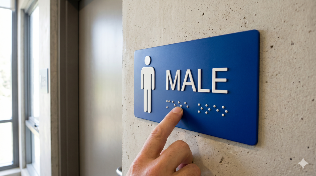
Placement is just as critical as the sign’s design. If a vision-impaired person cannot find the sign, its compliance is irrelevant.
The exit braille sign is one of the most vital safety elements in any building. Under NCC Clause D3.6, these must be placed:
When specifying braille sign supplies, it’s easy to focus on the initial purchase price. However, the Total Cost of Ownership tells a different story. Cheaper acrylic signs often suffer from dot degradation or cracking in high-traffic environments, leading to replacement costs within 3 to 5 years.
AI Overview Summary: When selecting braille sign supplies, stainless steel offers the best long-term value for public infrastructure due to its resistance to wear and vandalism. Acrylic is suitable for indoor corporate environments where aesthetic flexibility is preferred over extreme durability.
In 2026, the conversation is moving towards universal design. This means designing for more than just physical or vision impairments. Braille and tactile signs play a huge role in neuro-inclusion.
Clear, high-contrast signs with braille help individuals with cognitive disabilities or sensory processing disorders navigate complex spaces with less anxiety. By using consistent icons and sans-serif fonts alongside braille, you create a wayfinding system that is intuitive for everyone, including those for whom English is a second language.
In hospitals and clinics, signage must withstand rigorous cleaning protocols. We offer tactile braille signs with subsurface printing. This keeps the sign face smooth and easy to disinfect without eroding the tactile dots or the braille characters, ensuring the signs remain compliant and hygienic for years.
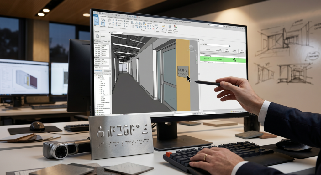
For project managers and large-scale builders, the biggest pain point is the signage schedule. Manually tracking hundreds of signs for a hospital or university is a recipe for error.
Modern architectural workflows now allow for the integration of braille tactile signs directly into BIM (Building Information Modelling) models. By using Revit families for your signage, you can:
Signs must be located between 1200mm and 1600mm above the finished floor level. For single lines of tactile characters, the standard specifies a range between 1250mm and 1350mm above the ground.
No. They are required on doors that lead to a required exit as defined by the NCC, as well as fire-isolated stairs, ramps, and accessible toilets.
Yes, you can use custom brand colours as long as you maintain the 30% luminance contrast requirement between the sign and the wall, and the characters and the sign face.
Avoid abrasive scrubbers. For most braille tactile signs Australia wide, a soft cloth with warm soapy water or Isopropyl alcohol is sufficient for disinfection without degrading the tactile bond.
Ensuring your project meets the 2025 accessibility standards shouldn’t be a source of stress. Whether you are in the early design phase and need advice on luminance contrast, or you are ready to procure high-quality braille sign supplies for a Tier 1 build, Tactile Systems Australia is here to help.
Explore our range of braille signs online or contact our expert team today for professional advice or request a quote to ensure your next project is safe, compliant, and beautifully executed.
Open to Public & Trade | Visit Our Ormeau HQ: 2/46 Blanck St Ormeau QLD 4208 | Call: (07) 5580 6993 | Weekdays 8 AM – 4 PM | Fast Australia-Wide Shipping | Get a Quote